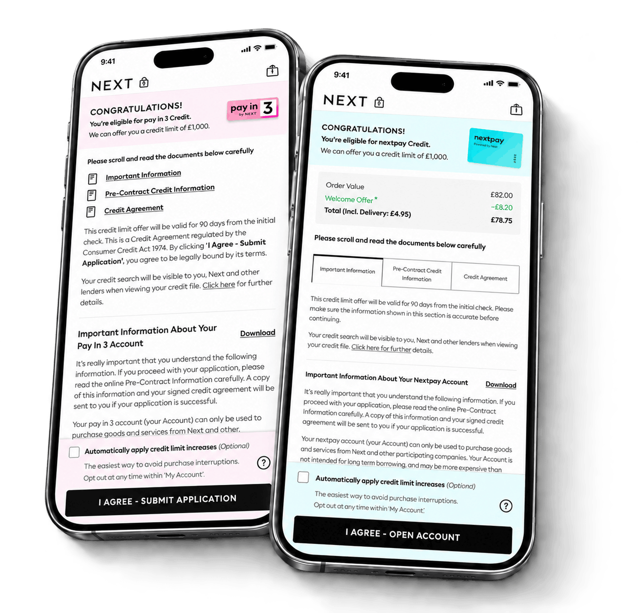
Less friction.More uptake.
Redesigning a regulated credit sign-up journey to simplify complexity, reduce drop-off and improve conversion across NextPay and Pay in 3.
ContinueUX Lead
Strategy Research Design
I led the redesign of the Next credit sign-up journey for Pay in 3 and NextPay after a compliance change caused a 15% increase in drop-out.
Using data and user insight, a few simple changes delivered a 7% conversion uplift and a 15% increase in automatic credit-limit uptake.
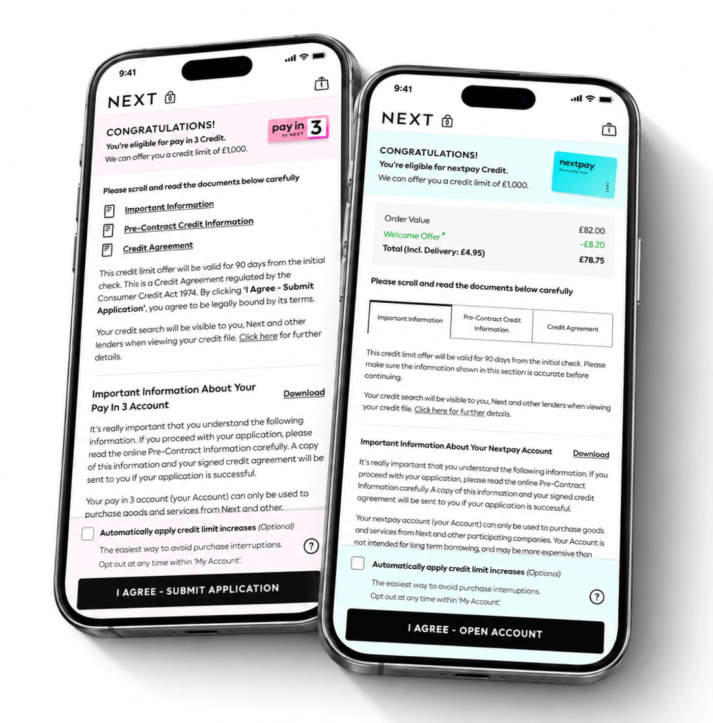
Data Insights
Next has two credit offerings: NextPay and Pay in 3.
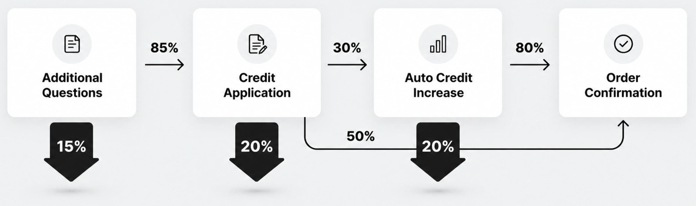
A recent compliance change introduced an additional eligibility step for roughly 15% of customers before they reached the credit application.
Looking across the full funnel for both credit products showed that the 15% drop was a concern—but a similar number of customers were also being lost at the credit-increase page.
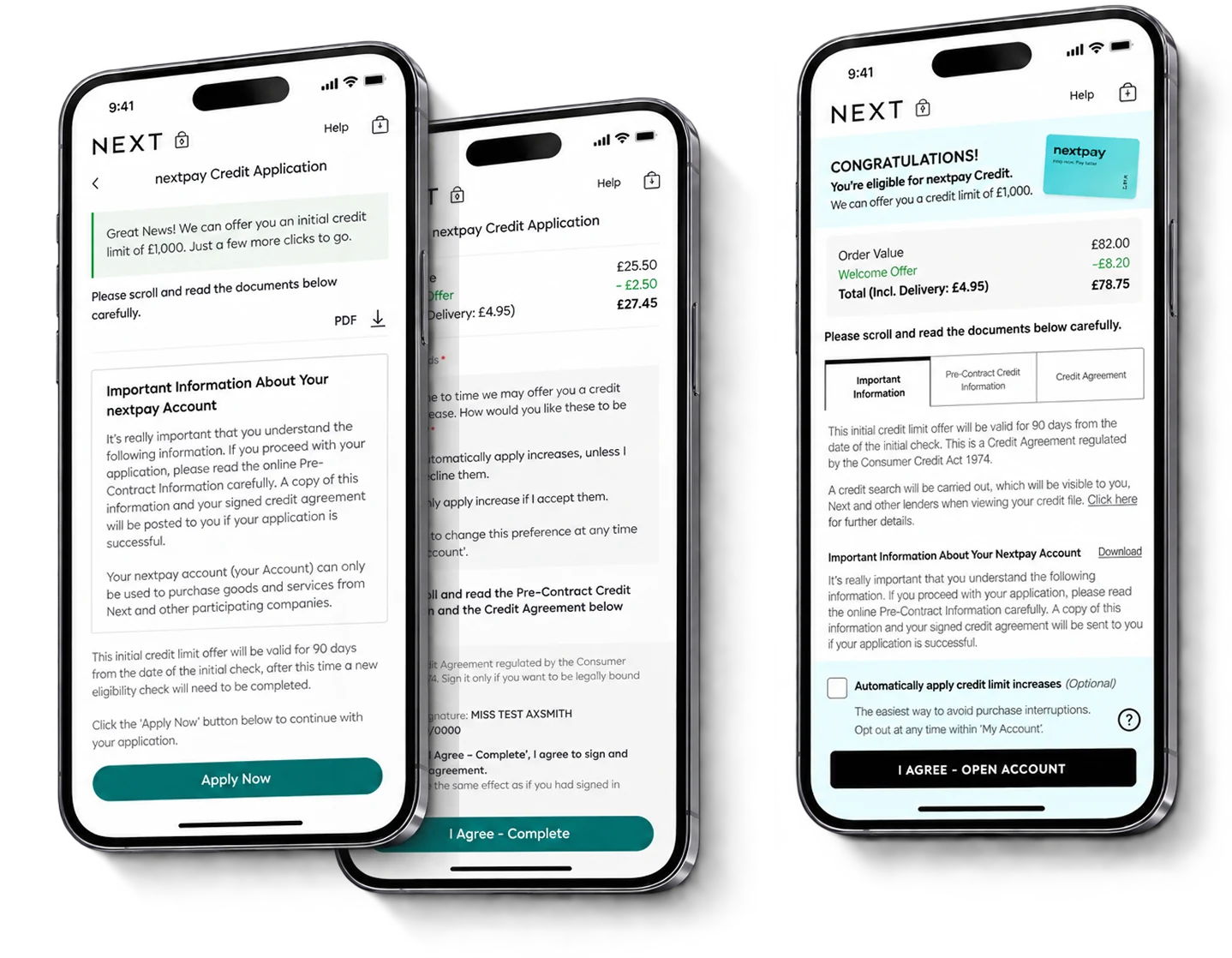
Combining the two pages into one offered a way to remove a decision point, reduce exits and recover some of those lost sign-ups.
Illustrative data funnel
Test & Learn
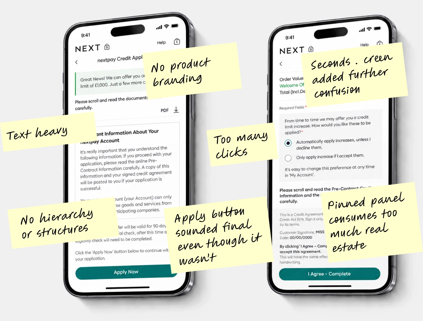
User testing
By carrying out a series of user tests, I was able to understand where customers found the journey confusing and identify where the data aligned with those observations.
I used Codex to build an iterative prototype, then presented it to the director to secure stakeholder sign-off before development.
Hypothesis
Combining the credit page and credit-increase page would let customers sign up with fewer clicks and present the essential information in a clearer hierarchy.
Two Steps into One
I presented the proposed solution to senior stakeholders to secure buy-in.
I then worked closely with product owners and developers through agile delivery, reviewing iterations and ensuring the final build met the intended design quality and user experience.
Impact
The final results were mixed and slightly unexpected. Pay in 3 delivered a 7% conversion uplift and a 15% increase in automatic credit-limit uptake.
NextPay saw a slight reduction in credit sign-up of 0.5%. Because the overall outcome remained positive, the new experience stayed live while further user testing explored the difference between the two products.
- +7%
- Conversion
- +15%
- Auto increase
- −0.5%
- NextPay conversion