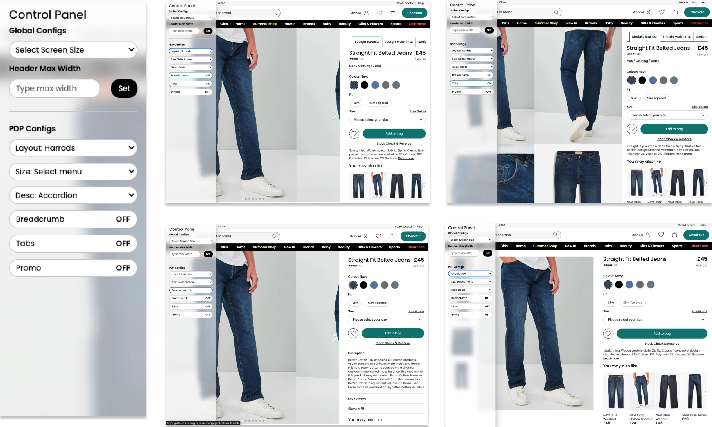
Product Page Modernisation

UX Design Manager

The shop window for hundreds of thousands of products across UK and International. 40% of customers start their journey here, so after years of incremental optimisation, it was time for a fundamental rethink.

Laptop displaying the modernised product page

My Role

  • Led the push for a New Product Detail Page (PDP) initiative, defining opportunity based on competitor trends, modern user behaviour and performance gains.
  • Framed the opportunities to senior stakeholders and helped secure opportunity to present to CEO.
  • Designed and built a fully responsive, configurable prototype to demonstrate layout flexibility, commercial opportunities and future scalability to board directors and CEO.
  • Provided direction and feedback throughout design and development stages to ensure consistency with design system and platform standards.
  • Supported Lead UX Designer throughout life cycle of project with all key decisions.
  • Acted as UX sign-off point, validating build quality against expected experience and performance standards.

Project Goals

  • With focus on Desktop and AOV, The primary goal was to maximise the use of modern screen sizes and help customers see our products with the clarity and ease.
  • Enhance product imagery with larger, higher-quality visuals.
  • Increase image visibility to reduce clicks and improve exploration.
  • Improve visibility of product information, product options and primary call to action.
  • Standardise fonts, spacing and visual hierarchy.
  • Leverage modern day formats to improve performance and include rich media content such as video.
  • Improve page speed through optimised, performant components.
  • Enable faster iteration and development for future enhancements.
  • Support theming for rapid rollout across international and Total Platform sites.

Context & Problem

All divisions across UK and International PDP see over 1 million session per day. Around 15 to 20% of this traffic is desktop and provides the highest average order value.

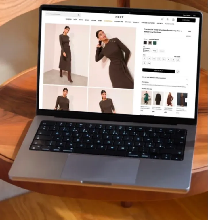
The existing PDP had been designed many, many years ago, at a time when typical desktop screen sizes were significantly smaller and connection speed were slower. As customer behaviour and device capabilities evolved, the template no longer made effective use of available screen real estate, struggled with core web vitals, specifically CLS, failed accessibility and looked dated.

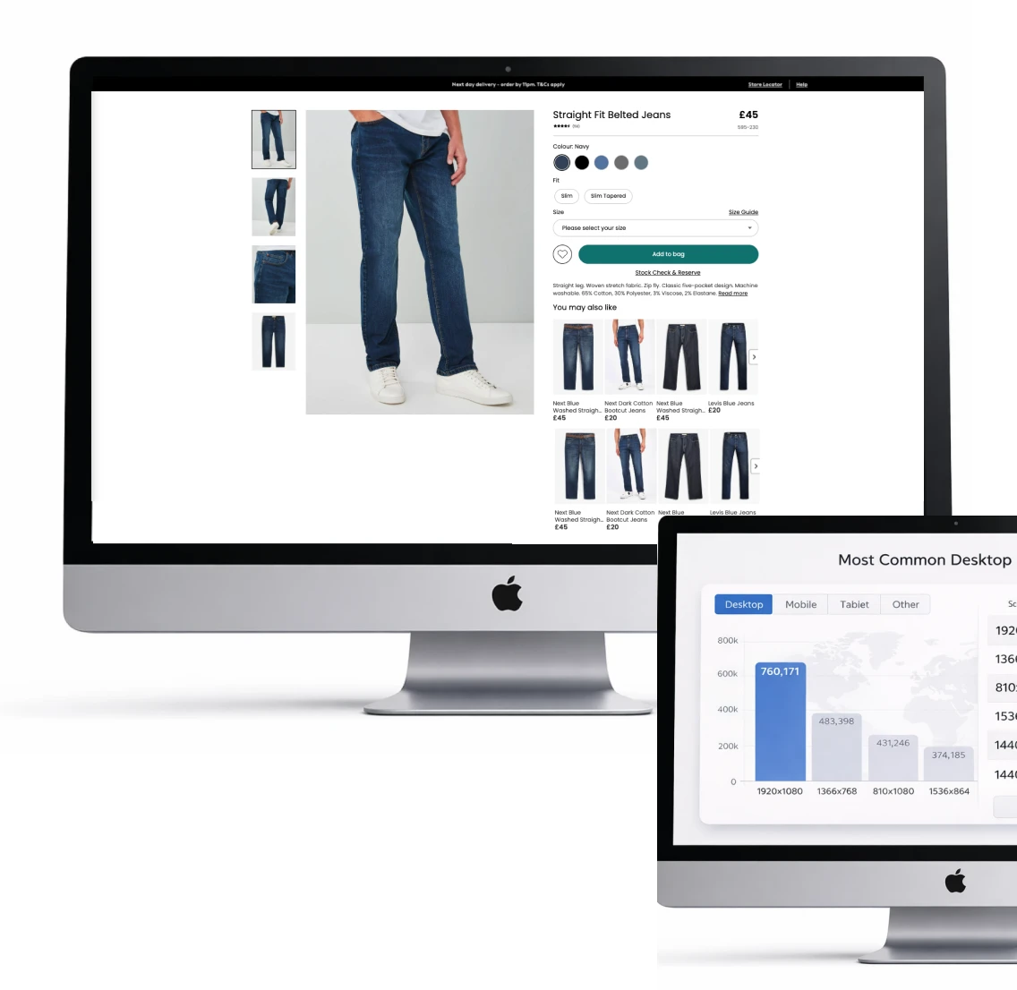
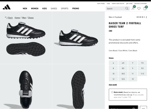
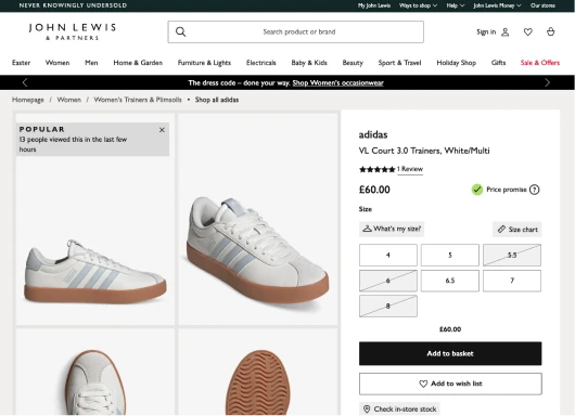
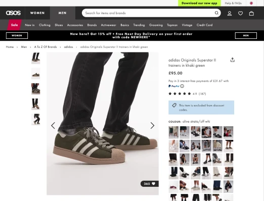
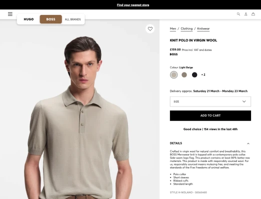
GA data showed us that 1920 × 1080 was the most common resolution, followed by other large desktop and tablet breakpoints. This resulted in 50% or more of the screen consumed by nothing, just white space, see example.

Existing product detail page shown on desktop monitors
Baymard Institute logo User Testing logo

Research and Competitor Analysis

To determine how best to layout the template and layout for the new PDP, my team and I carried out extensive research reviewing many key competitor sites and working with our user research team to understand how different approaches affected the experience. The insights from were such that customer preferred,

  • Larger imagery over text and option heavy layouts
  • Seeing multiple images especially zoomed in imagery without having to scroll or click was general preferred
  • Video was values, seeing customers walking and moving help provide a sense of the fabric, quality and fit
  • Although most customers preferred the grid layout (Adidas template) there were some concerns of the pinning mechanism so we needed to make sure we got that correct with the aid of a few POCs that we later tested.

We also reviewed Baymards to see how they comp analysis compared with ours to ensure what we were seeing was consistent with there’s, which it was.

Validation

Following competitor analysis and review of Baymard insights, we established a clear direction for a preferred grid-based PDP layout. However, this project extended beyond template selection. It aimed to improve core usability across product options, primary call to action, product description visibility, and upsell placement.

To validate that the proposed direction was best for Next’s customers, I leant on my old development skills and built a high-fidelity, configurable prototype. This allowed the research team to dynamically switch between three shortlisted templates, while toggling key features on and off. This flexible setup enabled robust usability testing across a wide range of real-world scenarios, maximising the value of each research session.

Configurable prototype options for PDP validation

Findings

Prototypes proved invaluable in identifying the optimal PDP template with customers. They enabled us to validate not only which layout best showcased product imagery, but also which provided the strongest visibility of key information such as product attribution, descriptions, and the primary CTA.

A key differentiator was the pinned side panel, which remained in view as users scrolled through imagery. This significantly improved access to critical information and reduced friction in the decision-making process.

Business Buy-in

The prototype was instrumental in securing executive buy-in.

By taking an interactive version to the CEO, we were able to present clear findings alongside a preferred direction. The ability for stakeholders to directly engage with the templates, including toggling features and exploring variations, built confidence in the solution and ultimately unlocked investment to move into development.

Design Handover

With CEO approval and investment secured, the project moved into delivery. I worked closely with the design team over several months to evolve the validated prototypes into high-fidelity designs, introducing new components and variables fully aligned to our design system.

Detailed specifications were then handed over to the systems team, enabling them to begin building front-end components in Storybook ahead of full integration. This approach ensured consistency between design and development, while allowing components to be tested and validated in isolation.

Design handover and component development view
Final product page modernisation example
Final total platform product page rollout examples

Impact

The new template delivered a +6.5% revenue uplift and +3.85% £PS increase, confirming it as the preferred experience. We would then continue to optimise features within the page Starting with the recommendation ribbons.

This project was a clear success, demonstrating the importance of early analysis and validating ideas upfront. By making decisions with insight and testing concepts early, we were able to confidently deliver a solution that improved revenue and conversion.

The new template was not only effective for Next UK, but was rolled out across all international sites and adopted by all Total Platform partners too.