Platform Modernisation

Next UK, Next Internatioanl and Total Platform

A huge transformation of legacy, fragmented code bases into a single responsive, component-driven system, enabling quicker, modern and consistent experiences across Next UK, International, and Total Platform partners.

Platform modernisation montage of mobile UI screens

My Role

  • Support design team at every step including existing features and rules analysis.
  • Bridge changes between legacy and responsive patterns.
  • Design system analysis, approach and scalable component structures.
  • Support feature prioritisation for upcoming sprints.
  • New feature quality gate and sign off sprint reviews.
  • Coordinate meetings across PO, BAs, trade, developers and stakeholders.
  • Senior stakeholder updates, presentations and alignment.

Key Project Goals

  • Improve site performance, page speed, layout stability and core web vital scores.
  • Reduce future development time through a component-based approach.
  • Tie front-end delivery directly to UX designs system via Storybook given UX control over front end CSS.
  • Move away from adaptive front-end to a single responsive system for all devices.
  • Create reusable templates and components for Next UK, International and Total Platform.
  • Improve accessibility across the estate where previously standards were inconsistent.

In summary, this was an overhaul of a very old legacy system that had become very challenging to work on and deliver modern experiences.

Getting Started

As this project was effectively a rebuild, there was a huge amount of analysis required. Much of the documentation from old projects was either redundant or “miss-placed” meaning the only way we could be sure was to work with POs, BAs and Devs to collectively identify many years of logic and rules. To make this even more challenging, we were moving from an adaptive solution to a responsive one and unfortunately the mobile and desktop experiences were not consistent.

Post-it wall used for planning and clustering insight
Journey mapping workshop in progress

Approach

  • We started by breaking down the platform into core UX layers, Header, Footer, PLP, PDP, Shopping Bag. Note This was a front end re platform project, Checkout and My Account were not in scope.
  • Audited and rationalised existing rules, features, and edge cases across Next UK, International and TP.
  • Distilled lots of minor UI and UX variants across platforms into standardised templates and components designed responsive-first.
  • Built a scalable component library aligned to front-end architecture.
  • Introduced theming capabilities to support multiple brands from a single codebase.
  • Worked section by section to reduce risk and enable progressive rollout. It was agreed that we start simple with the footer, then move onto the header, PLP and PDP.
Design system and tokenisation component library views

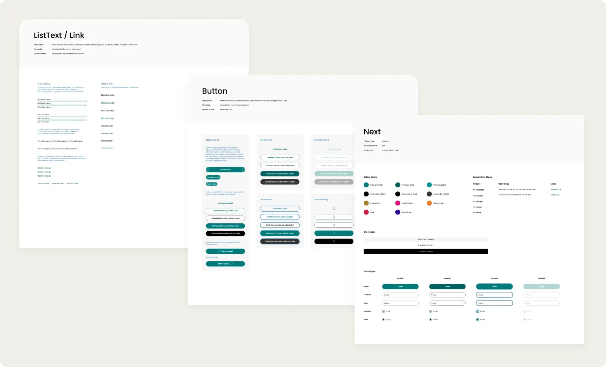
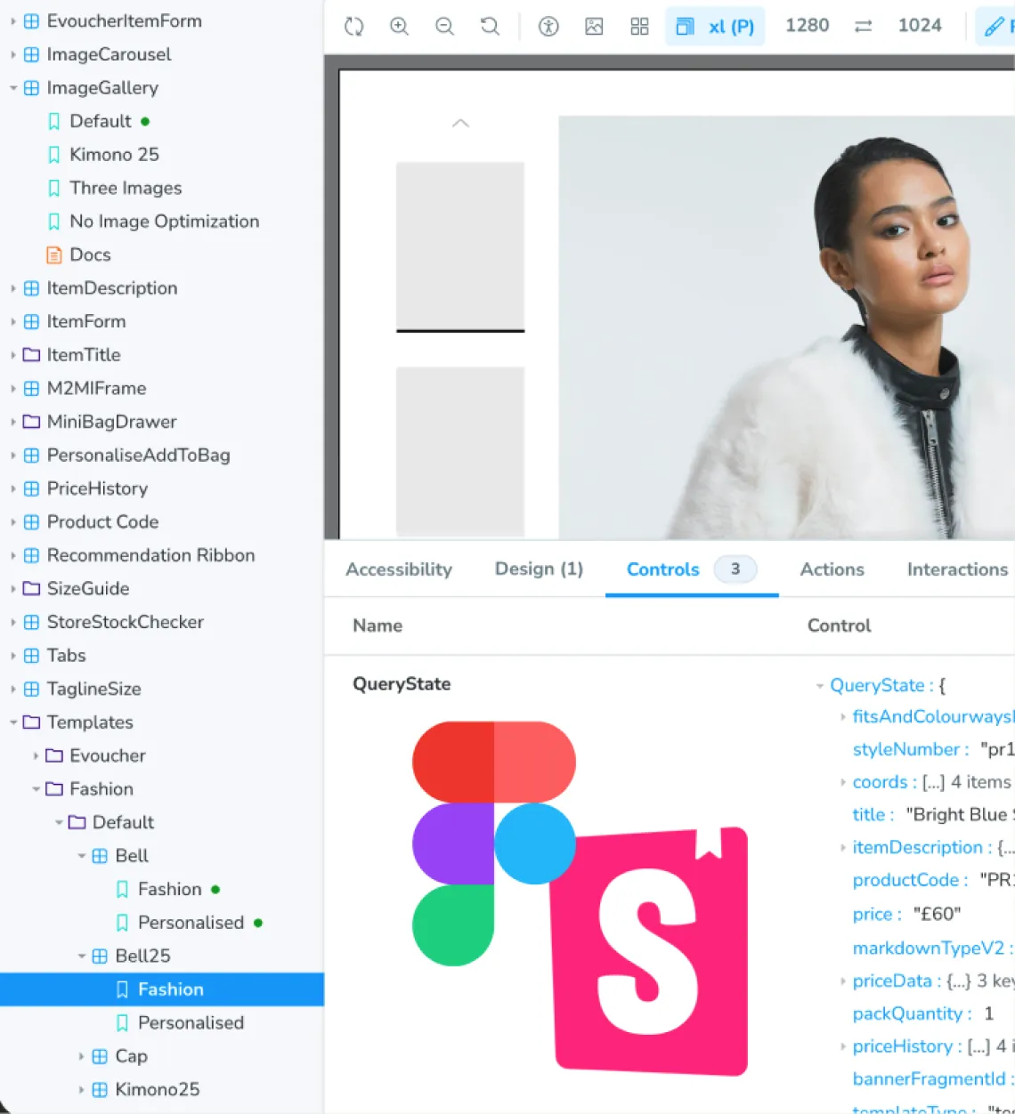
Design System & Tokenisation

To enable true scalability across multiple brands and markets, we adopted a design token approach as the foundation of our design system.

At the time, Figma variables were not mature enough to support the level of theming required. To overcome this, we defined a structured set of style tokens covering colour, typography, spacing, elevation, and component states.

This allowed us to:

  • Decouple design decisions from UI components.
  • Rapidly re-theme entire experiences without redesigning layouts.
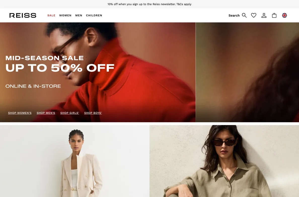
  • Ensure consistency across Next UK, International, and Total Platform.
  • Create a single source of truth that could scale across multiple brands.

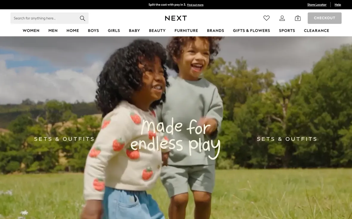
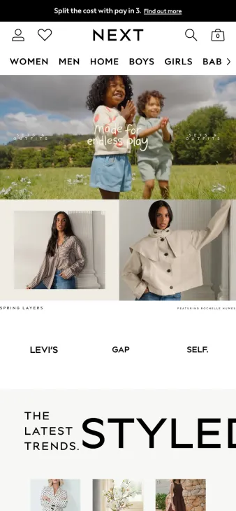
In practice, this meant a template could be fully rebranded in minutes by swapping token values, enabling the vision of “one site, many experiences” to become operational.

Component library and Storybook workspace

Components and Storybook

To ensure consistency between design and implementation, we adopted a Storybook-first approach to component development. All components were initially built and validated in Storybook before being integrated into the React front end. This created a controlled environment where components could be developed in isolation, free from product dependencies.

This approach allowed us to:

  • Validate components against design system standards and UX intent.
  • Test behaviour across states, edge cases, and breakpoints.
  • Ensure design tokens and theming variables were applied correctly.
  • Review components collaboratively across UX, Devs, and Product.

The Build

A major focus of delivery was reducing duplicated build effort across multiple estates. Shared foundations and reusable modules helped accelerate implementation while improving consistency and maintainability.

By shifting effort toward a more unified platform, the team could spend less time rebuilding solved patterns and more time improving the experience itself.

Testing

Validation happened throughout the process, from early concept checks and journey reviews to regression testing and live trading confidence checks.

This ensured the system was not only visually consistent, but operationally sound across devices, brands and markets before rollout.

Platform Modernisation delivered measurable impact across experience, performance, and operational efficiency. What once took weeks could now be achieved in hours, enabling rapid onboarding of new brands and consistent delivery across markets. This project established a long-term foundation for growth, positioning the platform to scale efficiently while continuously improving user experience.