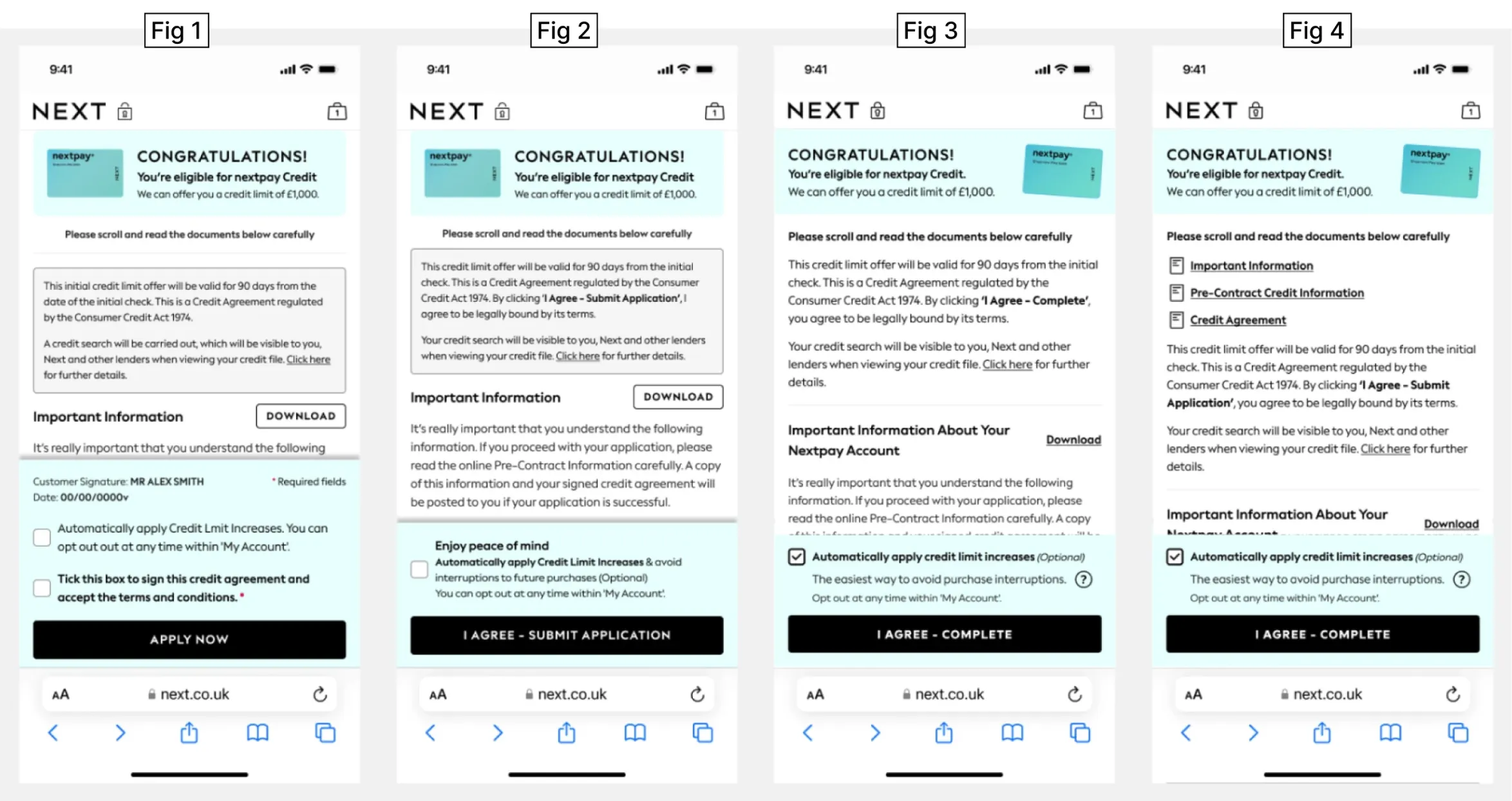
Credit Sign Up Journey

Credit Services - Next UK

Redesigned credit sign-up journey delivering +7% conversion uplift while simplifying complexity and reducing drop-off.

Credit sign up journey shown on a mobile phone

My Role

  • Translated data and journey analysis into clear, actionable UX problem statements and visual flows.
  • Produced early-stage concepts to secure stakeholder buy-in and investment.
  • Led and mentored a small design team to deliver user test prototypes and various iteration of the final designs.
  • UX sign-off across design and development to ensure quality and experiences were optimal.
  • Coordinated cross-functional alignment with credit service teams.
  • Partnered closely with legal and compliance teams to ensure the journey met all regulatory requirements.
  • Delivered senior stakeholder updates, presentations, and strategic alignment sessions.

Business Goals

  • Reduce drop-out across the credit application journey.
  • Increase credit sign-up conversion.
  • Increase automated credit limit sign-ups.

Customer Goals

  • Reduce friction.
  • Reduce cognitive load.
  • Reduce clicks.
  • Smoother, simplified journey.
  • Improved brand recognition.

Context & Problem

Next have two credit offerings, NextPay and Pay in 3.

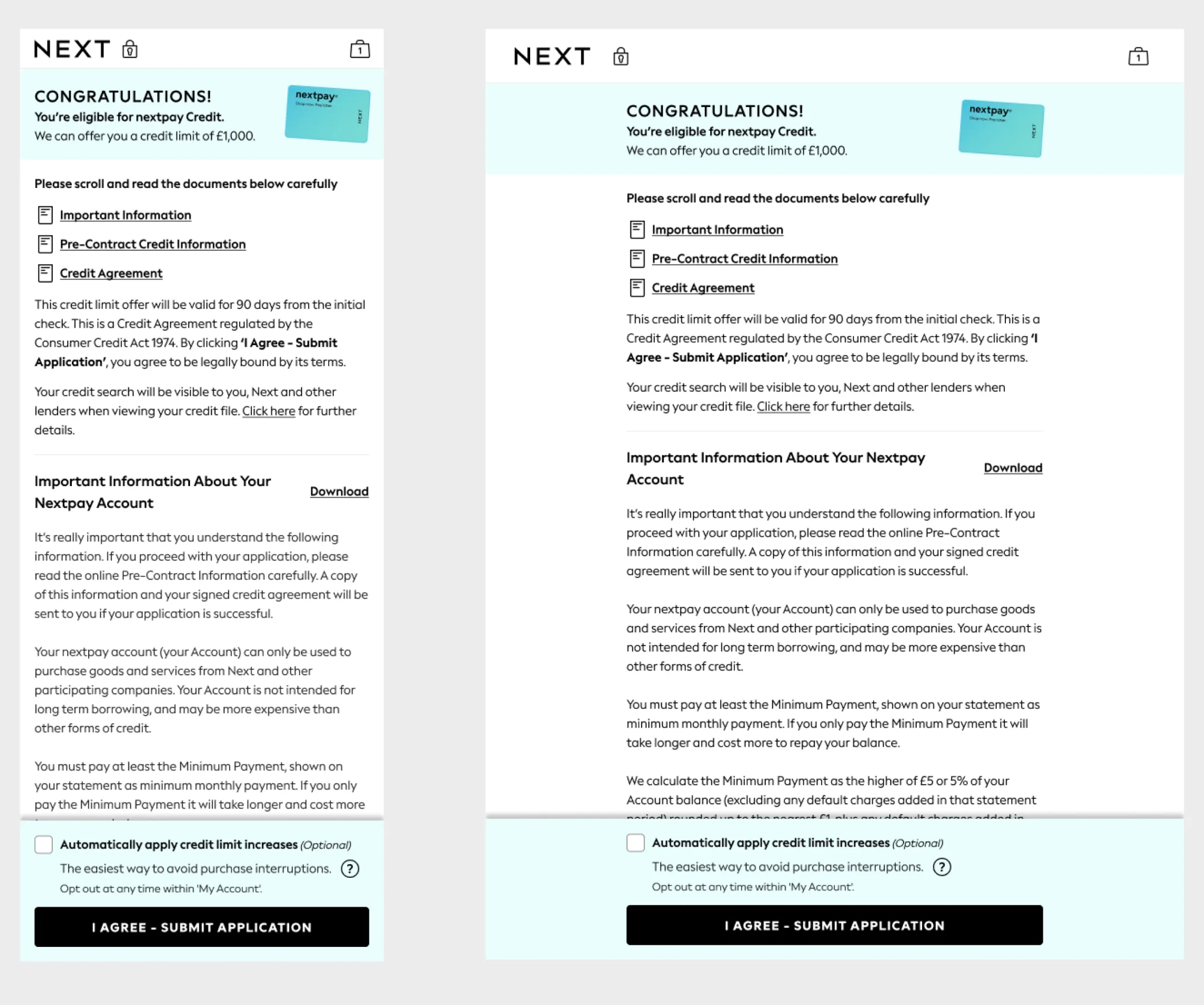
A recent compliance change introduced an additional eligibility step for roughly 1 in 5 customers before they reached the NextPay credit application. Naturally this extra step, added friction and contributed to increased drop-offs.

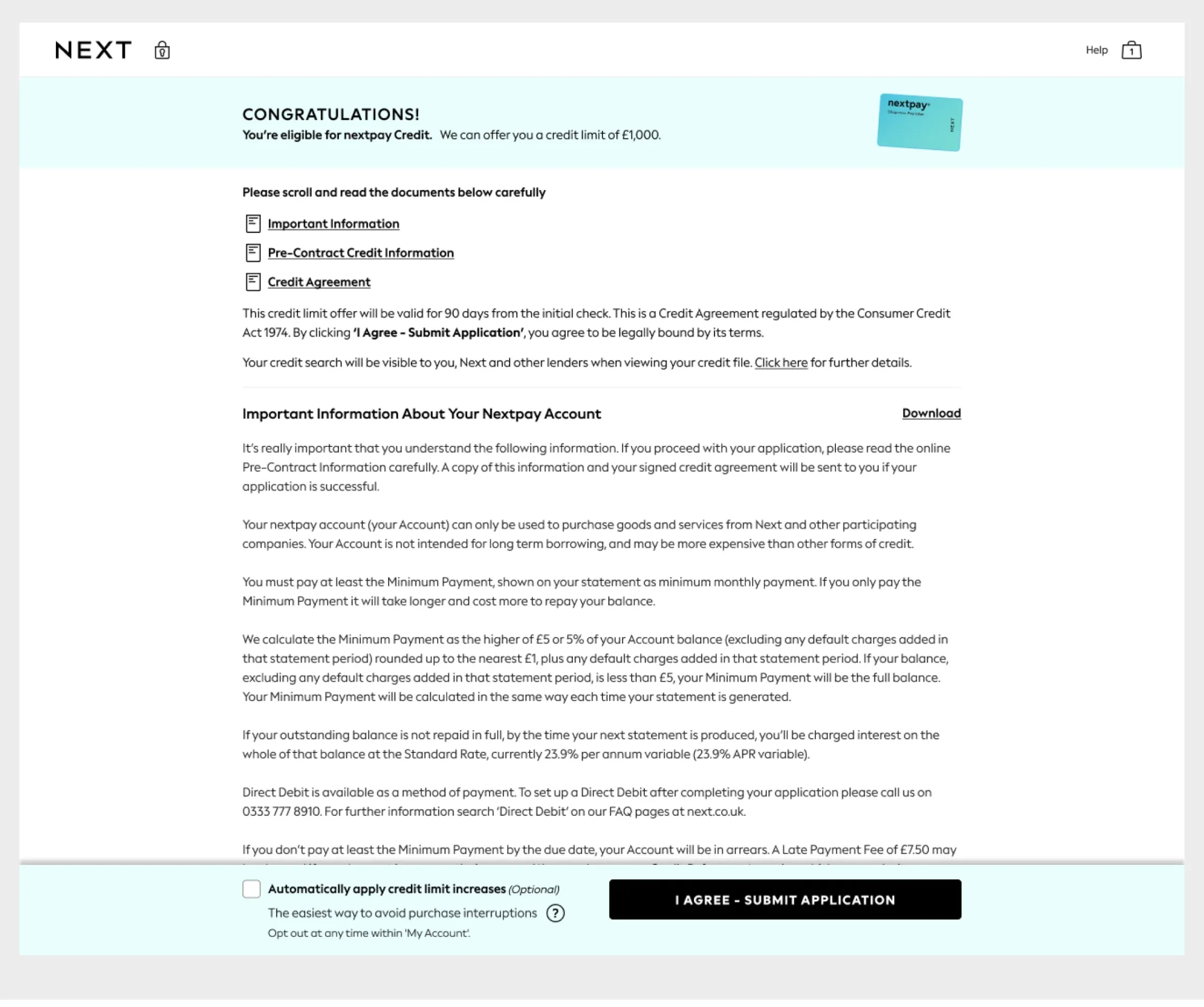
Around 15% of customers that were presented with these additional questions, dropped out before progressing to the main credit sign-up page. However, when we looked closer at the funnel data we could see an even bigger issue.

NextPay and Pay in 3 by Next logos
Credit application funnel diagram

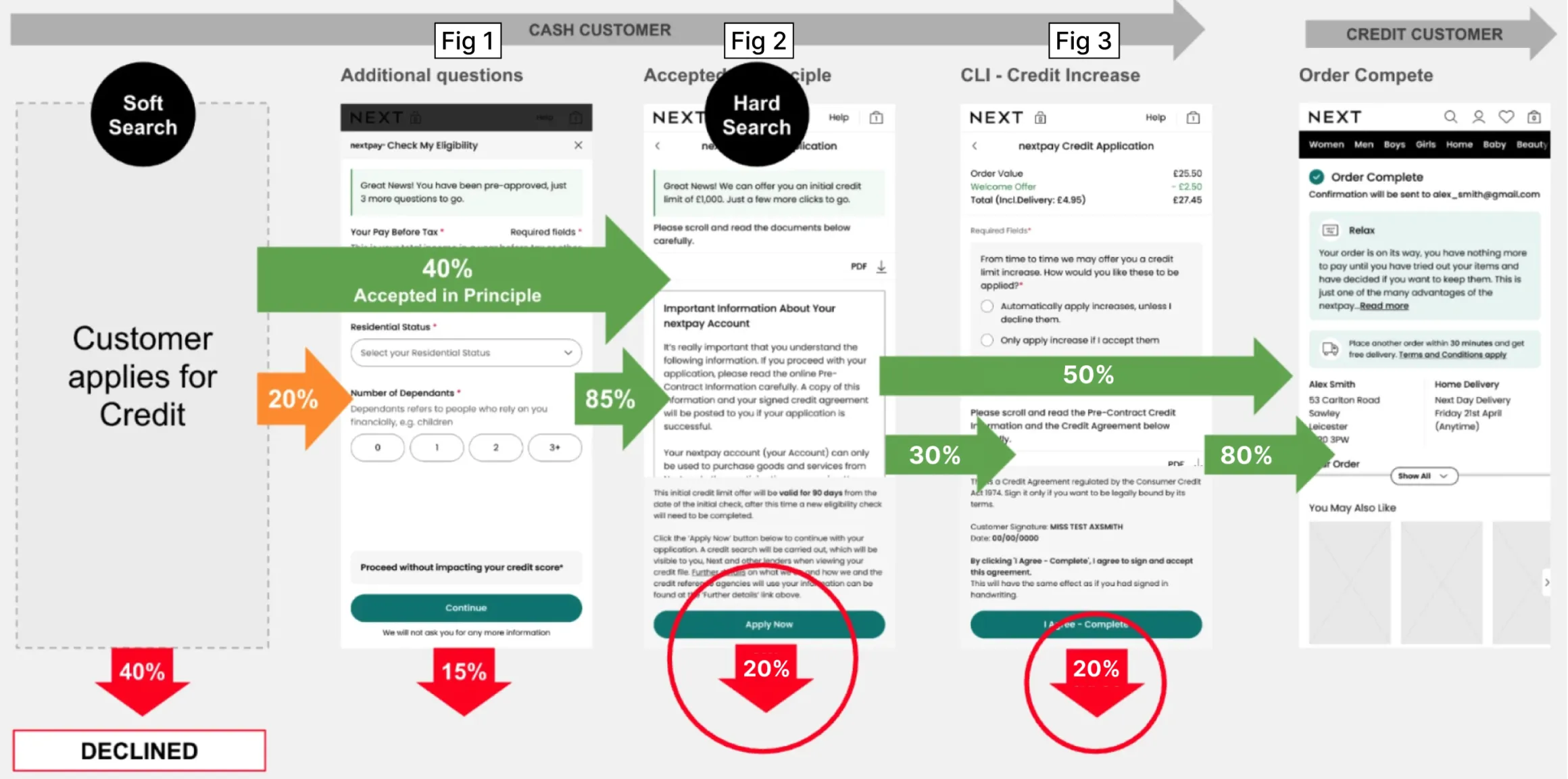
All figures shown are illustrative only and do not represent real Next customer data, performance metrics, or internal reporting.

Data Analysis

Taking the GA Funnel data across both Credit Products, It was clear the 15% drop was a big concern, but we were losing a similar amount at the credit increase page (Fig 3).

Therefore, if we could combine these pages into one we should reduce the exit and recover some of lost sign ups.

Hypothesis

By combining the credit page (Fig 2) and the credit increase page (Fig 3), customers could sign up with fewer clicks and be presented with a clearer hierarchy of information.

Before and after comparison of the credit sign up flow

Test, Learn, Confirm

After presenting the initial designs to the director of e-commerce, my design team then set about user testing various options using Figma Prototypes.

This was to see which ones were the simplest and consumable layout. See various options below.

Key aspects I was keen to understand included,

  • T&CS checkbox VS Single Submit button UI
  • Ease of finding important downloads
  • Which layout made it easiest to digest the important information
  • And of course, observe their behaviour when about each experience.
User testing variants of the credit sign up design

Development & Alignment

During the development stags, I worked closely with my design team, POs, BAs and Project Delivery Managers to avoid late-stage blockers. The build went well and we got the the new experience onto our A/B Test platform on the planned dates.

Final credit sign up desktop results
Final credit sign up additional results

Delivery, Results and Next Steps

Final results were a little mixed and unexpected.

For customers signing up for Next 3 Step, we saw a 7% uplift in conversion and a 15% increase in auto credit increase.

However, despite the NextPay experience being identical we saw a slight reduction in credit sign up -0.5%. As the overall impact was still very positive the decision was made to leave this live and do additional user testing to understand the discrepancies in each product results. These are currently underway now.

Pay in 3 and NextPay result summary